https://www.behance.net/gallery/23730535/Couture-Inc


Couture Inc branding is extremely feminine and chic. The designer has used a lot of shades of pinks and coral colours in the branding, which gives the overall aesthetic quite a feminine and elegant feel. I like the use of gold foiling and the floral touches here and there.
https://www.behance.net/gallery/10595861/Laser-Cut-Lace-inspired-Wedding-Invitation


I really love these wedding invitations. I think that they're classy and elegant yet so aesthetically pleasing and exciting to look at. I think that the gold foiling works really well as it helps to make the invitations seem so much more elegant and irresistible. I also think that the lasercut front cover to the invitations is such a nice touch and adds that sense of expensive quality to the invitations, making you think that the upcoming wedding is going to be amazing and worth going to.
https://www.behance.net/gallery/25782247/Redesign-da-marca-Marie-Lafayette-Alta-Costura


The use of white and gold in wedding stationary seems to be a very common occurence. I think that these colours work really well for weddings, as the use of white obviously reflects on the Bridal dresses worn and the purity of a wedding. The gold used adds an expensive taste to everything and helps to make it all look very elegant and desirable.
https://www.behance.net/gallery/26261617/Wedding-Invitation


I also really love wedding stationary that feels hand made. I think that this set of wedding invitations feel very simple and cute and really suit a down to earth wedding setting. I really love the linear illustrations that have been used.
https://www.behance.net/gallery/24717541/Event-Co


Again the colours are very minimal and feminine, using whites, creams and pinks throughout the designs. Flowers also seem to be a common occurrence when it comes to wedding stationary, websites or lookbooks.
- Leave your comment • Category: Brief 01 - Tephi Lookbook, Live Briefs, OUGD603
- Share on Twitter, Facebook, Delicious, Digg, Reddit
As I've been asked to create a lookbook for a wedding dress designer, I thought it would make sense to research into existing lookbooks / publications for inspiration.


https://www.behance.net/gallery/20106635/WILDFOX-Lookbook
I love the simplicity of this publication, and how they've made it look interesting even though it's mainly image based. I think it also helps that the photos used are really interesting themselves. I like the idea of an inconsistent layout, but it depends what the client is going for.
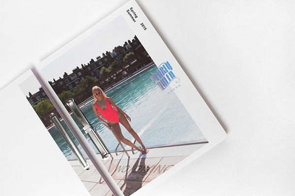
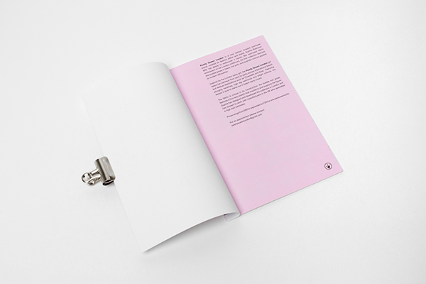

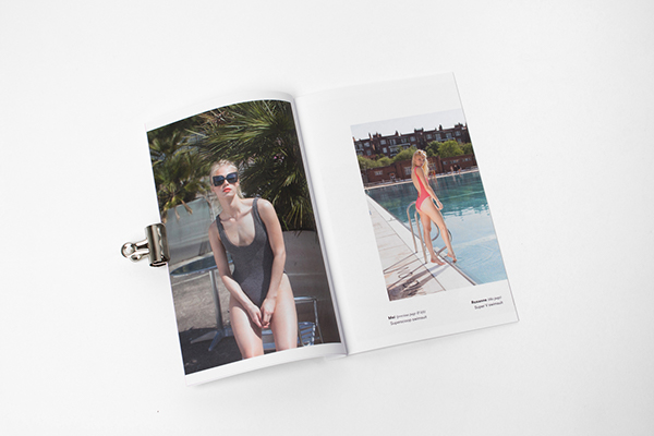
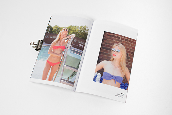
https://www.behance.net/gallery/18557941/Pearly-Queen-London
I like the idea of using coloured stock on certain pages within the publication, to pull the branding in. I also think these kind of layouts are more what the client is looking for, as she has stated that the publication will be mainly image based, and little text.


https://www.behance.net/gallery/20311689/Print-All-Over-Me-Collaboration
I like this lookbook, because of the fact the publication is focusing completely on the images and hardly any typography has been used at all, so there isn't anything that is going to distract you from looking at the clothes that they're promoting!


https://www.behance.net/gallery/9013561/Whistles
I love the simplicity and minimalistic feel to this look book. Even though there are more images to each page, it's done in a structured and clear way, so it still feels minimal and not over the top. Also, the lack of typography once again stops you from feeling distracted from the images. I also quite like the plain white and grey colour scheme, with colour only being found in the photography.


https://www.behance.net/gallery/13975795/In-Cahoots-Lookbook
This publication interested me, because I found the images quite alluring and the illustrative / collage feel that a lot of the pages had to them. Once again I loved the simplicity to the publication, and found that it worked really well alongside the busy and colourful photography.


https://www.behance.net/gallery/18582223/SWAERK-the-whimsical-shirt
I didn't like this publication at all, as I felt like it was far too vector based, and more about the strange design aesthetic than the images themselves. I felt like the designer was trying a bit too hard to be "hipster" with his design work, and it felt like something that was too on trend, and not suiting the context.
I've definitely realised that I prefer minimal design styles for this brief! The publications should show off the photography, rather than distracting your eyes.
- Leave your comment • Category: Brief 01 - Tephi Lookbook, Live Briefs, OUGD603
- Share on Twitter, Facebook, Delicious, Digg, Reddit