


I think that the logo looks better on the green steam trains, as the green and golden colours complement one another.
- Leave your comment • Category: Brief 10 - Design Something More, Competitions, OUGD603, workshop
- Share on Twitter, Facebook, Delicious, Digg, Reddit
I am really pleased with the final logo outcome, as I think it really suits the brand and reflects the style that I was going for. Although I really liked the use of the train vector in the logo, I didn't really think that a train needed to be in a train's logo, as it would be plastered on the trains themselves, so you wouldn't need the image of the train there. I think that the ornate logotype works really well on it's own and will look really nice in gold.
- Leave your comment • Category: Brief 10 - Design Something More, Competitions, OUGD603, workshop
- Share on Twitter, Facebook, Delicious, Digg, Reddit
I think that the Intern Magazine was a bit of a weird brief to work on. Working on something so quickly over one day wasn't really what I was used to doing, especially when you're working in a large group.
Because the brief was more about the concept than the design, I didn't really feel as though I was doing much during the day, as we couldn't all work on the same cover design together at once so we gave that role to Joe whilst the rest of us came up with Kickstarter campaign concepts etc.
Although I really like the concept and design that our group came up with, I didn't really enjoy this brief that much as publication and editorial isn't really up my street that much this year. I also found it hard to work in a large group on a one day brief, as deciding on ideas wasn't as easy with a group of you all coming up with different thoughts! I also felt as though there wasn't really that many roles that we could give to everyone in the group in order to feel as though you were working hard.
It was quite a laid back brief, but was interesting to work on none the less as it gave you more of an insight into how to set up a Kickstarter campaign - which could be useful to know for the future!
- Leave your comment • Category: Brief 05 - Intern Magazine, Collaborations, Evaluations, OUGD603, workshop
- Share on Twitter, Facebook, Delicious, Digg, Reddit

From there I chose to work with luxury train travel, and thought about everything you'd need to consider if you were going to create a whole new brand of luxury train lines..

Then I thought that I'd need to have a look at some research to show my aesthetic choices in the progress crit in the form of a mood board..
DEFINE:What should it stand for?
Affordable but luxurious travel - making people appreciate travelling by train and the idea of being able to go pretty much wherever you want to, whilst feeling just as relaxed and comfortable as when you stay in a hotel.
Why should it exist?
To encourage more people to travel by train when they choose where to go on holiday, rather than booking a classic tourist destination in an overpriced hotel and not experience real culture.
Why should people care?
Because they want something different and luxurious at the same time. Being able to travel all around several countries at ease will become appealing, as it's much cheaper and far more interesting than going from hotel to hotel by plane.
What makes it different?
You have the opportunity to choose where you go at more affordable prices (around Europe). You also don't have to worry about being uncomfortable or having a long 10 hour journey in one seat. You can choose how you spend the time on the train more freely, and can even spend the entire long haul train rides in the shower if you prefer!
CREATE:What does it look like?
Vintage feel, luxurious, something that would attract your eye as it looks different to other train lines.
What does it sound like?
What does it do?
Offers the tourist a luxurious travelling experience, whilst being able to see the countries to their fullest without spending hundreds of pounds flying everywhere. Tourists will get to get stuck in, choose where they get on and off the trains, and have a really comfortable and enjoyable experience throughout their travels.
Tone of voice?
Friendly, informative, luxurious, exciting
NAME:
Something to do with trains, luxury, travel….
- Locomotive
- Loco
- Euromotive
- Luxomotive
- Eurolux
- Opulence
- Exorbitance
- The Opulence Express
- The Opulent Express
- The Eurolux Express
- Deluxe Express
- The Grand Express
- The Voyager
- Leave your comment • Category: Brief 10 - Design Something More, Competitions, OUGD603, workshop
- Share on Twitter, Facebook, Delicious, Digg, Reddit
The task was to come up with a concept for a new independent publication and come up with a Kickstarter campaign that could possibly launch the publication. We were given a sheet with a list of existing independent magazines and a list of categories/genres they fall under as a starting point. On the sheet was also a list of magazine Kickstarter campaigns and how successful they were to aid us in creating a strong Kickstarter.
I had a quick look at some other independent magazine covers:


There were six points to address in the workshop:
Concept
Audience
Aesthetic
Strategy
Lifespan
Progression
Working in a group of 5, we came up with the concept for the magazine..


We decided to go with the name 'untold' and we all played around a little bit with logotypes, before regrouping to see what each other had come up with.
Whilst a few of the other team members designed the logo and front cover idea, the rest of us came up with how the Kickstarter campaign video would work..

Example of how the trailer aesthetic would look (but obviously ours would be a lot more lighthearted and would show snippets of interviews):
The final cover:


For the cover of the magazine, we wanted the very front page to be a thick stock with a circle cut out of the middle. Through the circle you can see the face of a man, but you can't really tell anything about who he is or what his profession is in order to not judge him before you read about his life. Then once you turn the page, it will reveal his profession and the stories that he has to tell about his life as a taxi driver.
We presented our ideas to Alec Dudson and the rest of the group. We received quite a lot of praise on the concept behind the independent magazine and the cover that we designed. However, we were criticised on our Kickstarter campaign, which we knew we had neglected slightly as we had spent so long coming up with a strong concept and design for the cover.
- Leave your comment • Category: Brief 05 - Intern Magazine, Collaborations, OUGD603, workshop
- Share on Twitter, Facebook, Delicious, Digg, Reddit
www.designsomethingmore.com
Based in Munro House.
Why brands need your help:
- How can we make them better??
What is a brand?
A logo? An identity??
A brand is standing for something, not always about the products, and often big ideologies.
For example: IKEA democratises design so that everyone can afford something that's well designed.
Brands which are wonderful experiences make our lives better!
- The smaller touches are what make them worth while.
Rory Sutherland - TED Talks.
- Any brand can be the cheapest. It's about having something new and different to make customers loyal to you.
Design is an opportunity to make a difference!
BRIEF - The Ministry of Wonderful
To rethink the brands of today to make them better.
How can the brand change the current customer relationship?
Create a brand from scratch - something new.
How to create your brand: define, create, build.
DEFINE:
What should it stand for?
Why should it exist?
Why should people care?
What makes it different?
- Big idea
- Name
- What you stand for
CREATE:
What does it look like?
What does it sound like?
What does it do?
Tone of voice?
BUILD:
Make stuff that's relevant to the brand and think beyond business cards.
Make sure you keep the brand realistic!
Interim Crit: 24/11/14
- Leave your comment • Category: Brief 10 - Design Something More, Competitions, OUGD603, workshop
- Share on Twitter, Facebook, Delicious, Digg, Reddit
I learnt a lot about awkward clients from working on this brief. I definitely realised that setting limits and asking to be paid, rather than doing work in exchange for their skillsets, is a lot more beneficial as it means that the clients won't waste your time. I have also found that when you ask to be paid by a client, it scares off any time wasters!
Working with Jessie when we met up was really useful. I hadn't worked with a client face to face before, but it was really helpful as we could bounce ideas off of one another. Talking to Jessie face to face also helped with understanding the brand properly.
I haven't really done that many branding briefs, so this was definitely a challenge for me as it felt like a lot to take on. However, I really enjoyed working on it as it made a change from the usual stuff that I worked on. Deciding to stop working for Jessie took a lot of stress off of my shoulders and meant that I could concentrate on my COP and work on finishing her brief in the background, rather than making it priority.
I learnt a few different things about Illustrator and Photoshop from working on this brief, but the main things that I learnt were when it came to web designing on Wordpress. I didn't realise that you had to work through the wordpress.org in order to totally customise the coding, which was annoying as we had directed the custom URL to wordpress.com and you can't redirect a URL for a few months. This meant that my web design ideas were very limited, however I really liked how the website ended up looking!
I think that working on this brief taught me a lot about working with clients and also made me feel a lot more confident about my skills and designs.
- Leave your comment • Category: Brief 03 - BYT Branding, Evaluations, Live Briefs, OUGD603
- Share on Twitter, Facebook, Delicious, Digg, Reddit
After much consideration with Jessie, we decided not to carry on with this brief. I found it really hard to meet up with her as she was busy with work and it was hard to find the time to talk about where we would be taking things. It was also hard to stop her from making loads of changes, as she was constantly changing her mind and couldn't really decide how she even wanted her brand to look like or to resemble. This made working for her difficult, as I felt as though I was putting in a lot of time for not much reward (as she wasn't paying me and was offering her photography skills in return if I needed them).
After speaking to Amber about the difficulties with working with Jessie, we decided that it wouldn't be worth stressing over this brief as I needed to work on my dissertation etc. However, we did decide that it would be a good idea to design what I would've produced for Jessie but in a way that I would've liked the brief to go if I had carried on with it!
I decided to create mockups of the final designs, rather than printing and photographing the brief as I didn't really want it to go on for much longer and I didn't feel as though there was much point in getting the work printed as I wasn't entirely proud of what I had been producing.
I decided to keep the rest of the branding stationary very minimal and just highlight the colour red here and there, as this linked back to the idea of the compass in the logo and the theme of the brand.
You can see the website for real at: www.bytphotography.com
Please bare in mind that the website wasn't entirely finished in terms of content and was only filled with images that were supplied to me by the client.

I liked the idea of having triplex cards so that the edges could be red, for an extra flash of colour like in the mockup above. Unfortunately I couldn't figure out how to make it look the same on the below mockups.


I also thought that she could send out large watermarked photographs in some kind of pack as a form of promotion to potential customers.


I produced the web design on Wordpress. The circles used for the photographs were inspired by the circular shape of the logo itself.
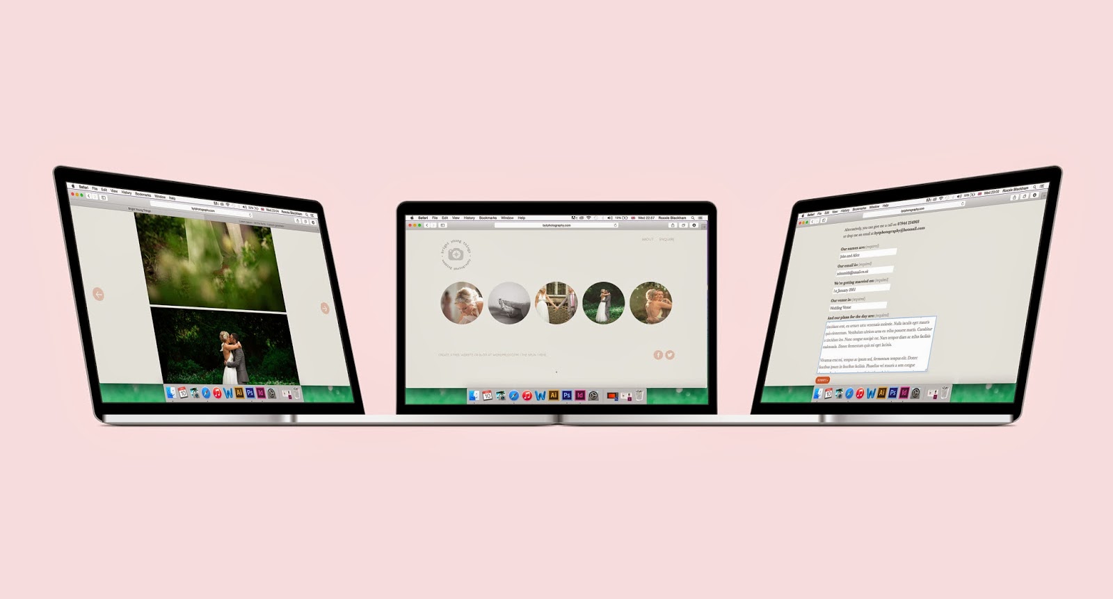


As I created the site live on Wordpress, I could easily make the website responsive so that it worked across different platforms too.

- Leave your comment • Category: Brief 03 - BYT Branding, Live Briefs, OUGD603
- Share on Twitter, Facebook, Delicious, Digg, Reddit