OUGD603: Typography A Day Keeps The Doctor Away (Brief 9)
by Roxxie Blackham on Tuesday 31 March 2015
As part of personal self practice within my lettering, I've decided to dedicate three days to producing typographic designs based around whatever is going on in my life at the time. I quite like the use of quotes, but have also decided that I don't need to be limited to working with quotes and can work with just the one word or whatever...
I have decided to set these as one day briefs over three days in order to free my mind and allow my creativity to flow without any limitations. I feel as though sometimes you need to work on things that come completely naturally to you in order to relieve stress and relax.
I want these designs to be quick to come up with and something to help myself improve upon my lettering skills.
Day 1


Final Poster


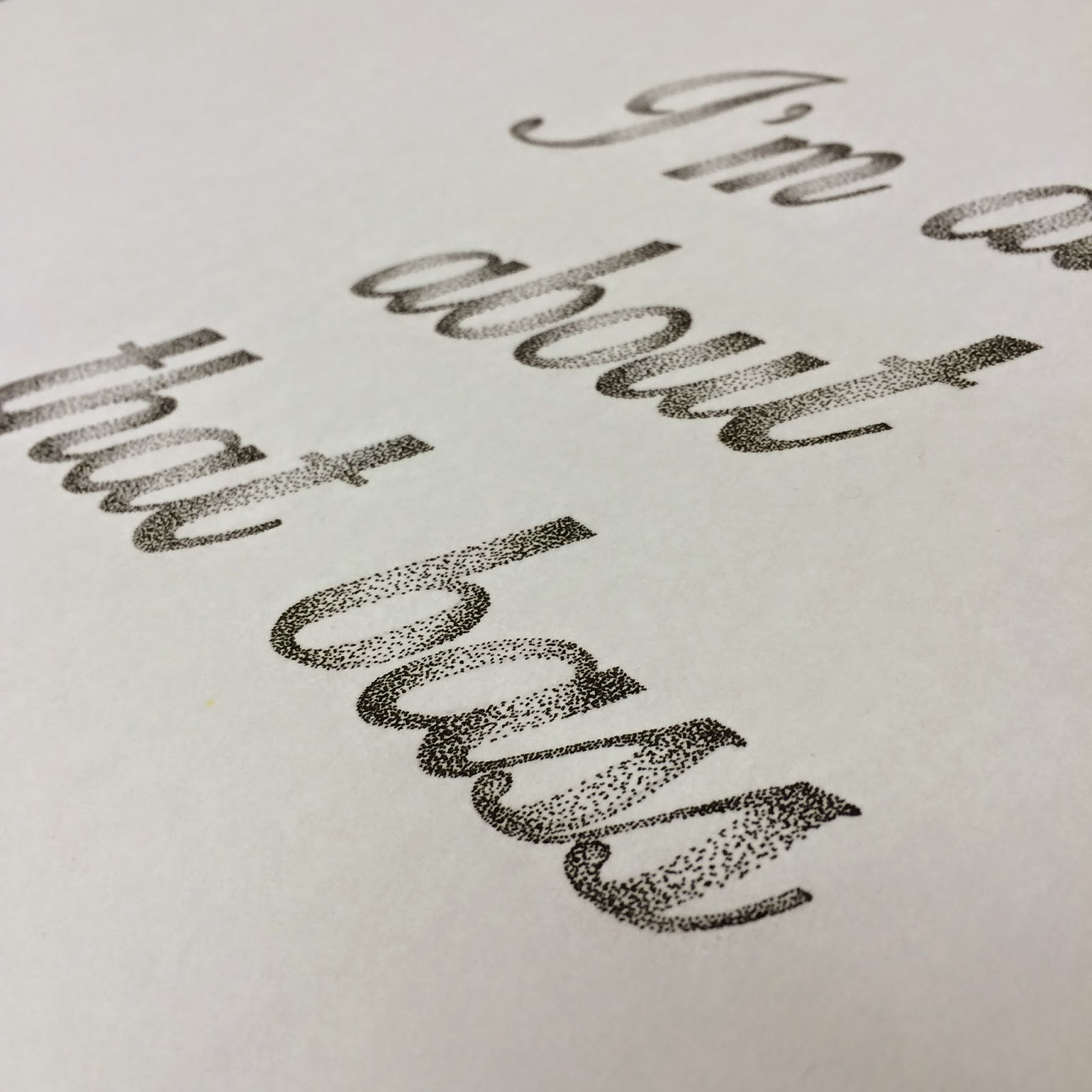


I am extremely pleased with the outcome for this poster. This was my second attempt at incorporating stippling and I definitely think that it was worth while. The poster took me about 7 constant hours to complete, as I was determined to finish it that day, and I am really happy with it. I definitely think that pushing myself to try something out of my comfort zone was rewarding.


Day 3
I realised that I haven't done much hand rendered typography that has then been vectorised, so with my Amsterdam trip coming up in a couple of weeks, I decided to create something inspired by that!
I created a quick typographic sketch with pen and pencil on some paper, then vectorised it on Illustrator. I decided to try and design something different to my usual style as I know that I love to use script fonts and don't use sans serif or serif fonts that often, so I decided to work with something different to usual to see what I produce!


I had a go at colouring the typography in using some spirit markers...

But I wasn't entirely keen on how it worked out, so thought that vectorising the typography would definitely help with this issue!

Tracing over it on Illustrator was easier than I expected, but I thought it still needed some illustration or something to add to the design, so I decided to create some tulips, as The Netherlands are very well known for their tulips...

I wasn't too keen on the colour in the background, but was definitely loving the tulip pattern going on!
Final:

Although this design was very random, I'm really pleased with what I managed to produce in a couple of hours. I'm also proud of myself as I try to steer clear of typefaces that aren't swirly and girly, so designing this proved to me that I can play around with sans serif typefaces if I put my mind to it! Also deciding to vectorise the design meant that I could play around with bright colours, rather than creating black and white sketched designs. It also meant that I improved on my skills in Illustrator which is always a bonus!
- Leave your comment • Category: Brief 09 - Typography A Day, OUGD603
- Share on Twitter, Facebook, Delicious, Digg, Reddit

I really love the vibrancy of this poster due to the addition of rich colours.

I absolutely adore stippling, especially when it has been applied to typography. This is definitely something that I want to consider improving within my designs.

I think that highly illustrated letters look amazing. I don't think that my personal drawing skills are quite up to scratch to attempt something like this, but it's a definite goal for the future!


Again I really like the colours used for this poster. The typography has been drawn and then vectorised afterwards, which is something that I don't often do with my designs, so I think it will be a good thing to learn during this brief.


I think that the intricacy to this design is really good and the added ornaments really finish the typography off so well.

More vibrant colours that really catch your eye. I definitely want to try and incorporate some colour into my typography to see how it adds to my designs.

I've always loved painted typography and think that the ornaments and decoration to the typography compliment one another. It's also nice to see a little bit of colour added to the design.


I love the detail to this design and I think that all the linear illustrations and ornaments work really well.

I love letterforms that have been illustrated like this. I think that they look really elegant and show off a lot of drawing skills in the designer. I also think that they can make letters look really attractive and added ornaments complete the design.
- Leave your comment • Category: Brief 09 - Typography A Day, OUGD603
- Share on Twitter, Facebook, Delicious, Digg, Reddit