I played around with an online .gif generator to see how the posters could be animated or used as a .gif....
Obviously if we were to use this, we would properly generate a .gif on Photoshop, so that it's a larger size and higher quality!! This was simply to show the rest of the group how I thought the posters could work as an animation or flashing image.

- Leave your comment • Category: Brief 07 - DBA, Collaborations, Competitions, OUGD603
- Share on Twitter, Facebook, Delicious, Digg, Reddit
After our meeting, we decided that both Amy and I were going to work on developing the poster ideas and combining mine, Joe's and Amy's ideas into a working set of posters.
Amy produced a few ideas and then sent them over to me to work on. These were Amy's ideas:


We all decided that the shapes used need to stick within the isometric grid and were going to be cubes or cuboids. We also felt as though images weren't really going to work in 3D shapes, and should be placed in more simple isometric shapes. The blocks also didn't look right when they were filled in with a colour, so I started to make some changes to the poster.
This is what I came up with:

As everyone quite liked the 3D illustrations that I had previously created, we tried to incorporate these into a simpler layout with larger images.
Feedback given was that there was too much white. We all also felt as though the illustrations were distracting and didn't really compliment the rest of the poster.

So I changed the background to black, which helped to highlight the colours used in the strokes for the cubes and cuboids, and deleted all the trees and buildings.
Feedback given was that it felt a bit empty and should look like everything is coming from the middle.

The poster still looked quite empty in the middle, like there wasn't really much going on with the blocks. Amy also commented on the fact that she wanted to try to incorporate the 3D letterforms that she had created, so I recreated the letters as she had produced them on photoshop, and looked at how these could work in the middle...

I quite liked how the letters were working out in the middle, and tried the whole design with the Manchester poster, as I thought that the M would be hard to create using the isometric grid..
Unfortunately the M really wasn't working. I spent about an hour twiddling away with it trying to make it look right, but it really didn't work. Which was disappointing. So we all came together as a group to see what everyone has had been up to in order to come up with more ideas.
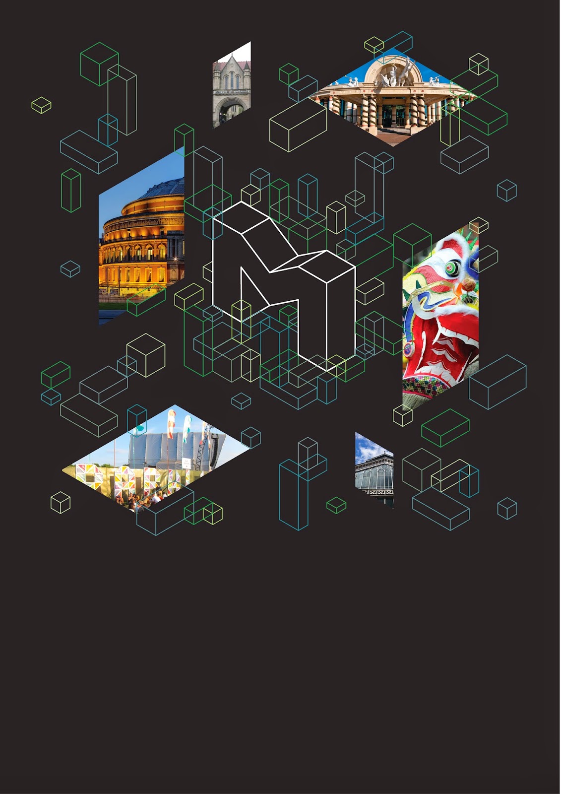
We all quite liked what Joe had done with his ideas and how he incorporated the logo and images in a larger size on the poster:


This looked SO much better!! It also helped to add body copy etc to the poster to see how the imagery worked alongside typography. At first the logo in the middle was filled in white, but this stood out too much so I created a gradient using the colour palette, and this was much more complimentary!
The images that I used for each poster were as following:
Leeds

Leeds Civic Hall
.jpg)
Broadcasting Place

Parkinsons Steps

Leeds Trinity
Manchester

University of Manchester

Museum of Science and Industry

Chinatown

The Trafford Centre
Hull

The Deep Aquarium

The Humber Bridge

Hull Maritime Museum

Freedom Festival
Liverpool

The Liver Building

Museum of Liverpool

Metropolitan Cathedral

Echo Wheel of Liverpool
The 4 Posters:


Joe then suggested placing the images in different areas of the logo for each poster, so I played with this idea..


I liked the way that the images looked like they were moving around the logo - could look really cool as an animation or a .gif!!!
Obviously the body copy will still need work, and Joe has created a custom typeface for the brief so this will need to be applied to the poster, but this will be fine for the meeting tomorrow!!
- Leave your comment • Category: Brief 07 - DBA, Collaborations, Competitions, OUGD603
- Share on Twitter, Facebook, Delicious, Digg, Reddit
Since the last crit and meeting we had, I tried to create some new logo ideas using 3D shapes, impossible shapes and isometric grids...

I tried to create a 3D shape out of the C and N from Capital North. I thought it was quite an interesting image, but didn't really suit the brand that well.

I then thought of how that shape could work as a pattern..

I also thought of how you could create an impossible N structure, so I tried to create one that was 3D. I quite liked this shape

I thought about how this could be used as a pattern in the shapes of the cities..

And then made a clipping mask from this..

but I didn't really like how that was working out.
I then thought about how the 4 cities could join together to create a new shape for the new capital..

I quite liked this shape, as it was a combination of all 4 cities.

I tried using some typography to make more of a logo, and played around with the shape of the new city shape. I also tried making the shape out of triangles to make it seem more 3D and interesting. But everyone felt as though it looked like we were creating an entire new country, and didn't really work that well.
Back to the impossible shapes...

These weren't really working as well as I thought, so I reconsidered the shape of the N and tried to use the isometric grid a bit more..

I really liked these logos. I thought the colours used made it quite contemporary and I liked how the N was confusing, just like an impossible shape.

I then played around with some pastel colours..

And how the shape would work just with outlines..

And then in boxes, using quite strokes. I really liked how this logo looked, but when we met up as a group Will and Joe had much stronger ideas, so I decided to leave the logo development to them.
After we met to discuss the logos, we all decided that using isometric grids will help to limit all of our ideas down and set a basis grid to work from.
I saw some cool isometric cityscapes online in the past, so tried to create something similar for us to use in our posters...

I created this on Illustrator, and it took FOREVER. I hadn't really used isometric grids before, and Illustrator really seems to struggle to snap to this kind of grid, so there was a lot of fiddly work and it really strained my eyes! I was really pleased with where it was going, but unfortunately it really wasn't suitable for the brand, as it didn't feel professional enough, and seemed quite playful!
After we all met up to discuss our ideas, we decided on what everyone was going to do from here onwards. We also decided on the following logo, which Joe produced:

Both Amy and I were placed in charge of further developing the posters, by combining elements of mine, Amy's and Joe's poster ideas..
Joe's ideas:
- Using cubes and cuboids on the isometric grid
My idea:
- 3D illustrative city elements
Amy's idea:
- Coloured gradients
- Using images within the shapes
- Leave your comment • Category: Brief 07 - DBA, Collaborations, Competitions, OUGD603
- Share on Twitter, Facebook, Delicious, Digg, Reddit