OUGD603: Jessie Leong Further Logo Development (Brief 3)
by Roxxie Blackham on Wednesday, 29 October 2014
After a quick chat over the phone, Jessie had a few new ideas for her brand that she wanted me to play around with. She had thought about her target market for wedding photography, and realised that she wants to work with a secondary logo based around her love for outdoor weddings. She was interested in working with a compass shape, or ways of incorporating nature into the secondary logo, so I had a little go on Illustrator before meeting up with her a day later...
When I met up with Jessie, we spoke about where to take her brand now and I received the following feedback:
- Try writing the words around the camera in the logo in a circle
- Image watermark (compass icon, byt icon - show more examples of these)
- Have a look for a b that works better (easier to read) for the logotype
- Maybe try a different typeface? Think about legibility
- Have a look at www.jamesandlianne.com/wedding-photography-contract-form/ for booking form inspiration and details
- Banner watermark (include contact details, location, logo etc)
- Think about pinterest, twitter, instagram, facebook and their icons
- Business cards (play on maps, scales, meter readings, compass design, details on the back "find me at...")
I've decided to work with the following logo..

And banner logo..

Jessie was a bit unsure about the typography, so I showed her how the logo could work as watermarks..

And how the banner logos could work on images as well..


I think the banner logo works really well in context, as it adds another element to the photos and helps bring in the branding ideas. I also really like the shape of the logo, as the curved element makes it softer against the images.
After Jessie saw how the logo works as a watermark, she was a lot happier with where things were going and said that she really likes the logo in white!
Jessie also sent me the following manifesto:
Bright Young Things is a wedding photography company of Jessie Leong, a yorkshire-based photographer who specialises in the outdoors. Whether its up a peak of a mountain or walking through the depths of a forest, Jessie hopes to bring her love of working in all conditions and beautiful views to her photographs, and wants to work with couples who love it too.
I created some banner images that she could use on her website or to send out in her pack to prospective clients.


- Leave your comment • Category: Brief 03 - BYT Branding, Live Briefs, OUGD603
- Share on Twitter, Facebook, Delicious, Digg, Reddit
I didn't really receive a large amount of feedback, due to the fact that the work I was showing was either completed or for a client so was meeting their needs, but what I received was as follows:
- Look at blogs for Jessie's website, as they're easier to use and will meet her needs
- Try using the camera logo more for a watermark
- Try using some colours in the logos
- Keep the website simple
I was quite surprised with myself when working on this brief with Dr Me! I don't usually enjoy designing vinyl covers, but I found the workshop with Dr Me really enjoyable, as we were encouraged to work off the computer and see what we could come up with by making collages or drawings etc.
- Leave your comment • Category: Brief 06 - Dr Me, Collaborations, Evaluations, OUGD603, workshop
- Share on Twitter, Facebook, Delicious, Digg, Reddit
OUGD603: Lunasol Branding Photoshoot Research (Brief 2)
by Roxxie Blackham on Monday, 20 October 2014
Photography Inspiration...
http://www.vanessamooney.com/collections

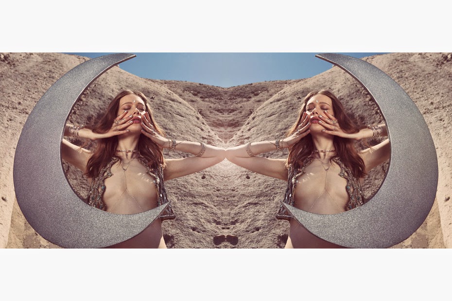


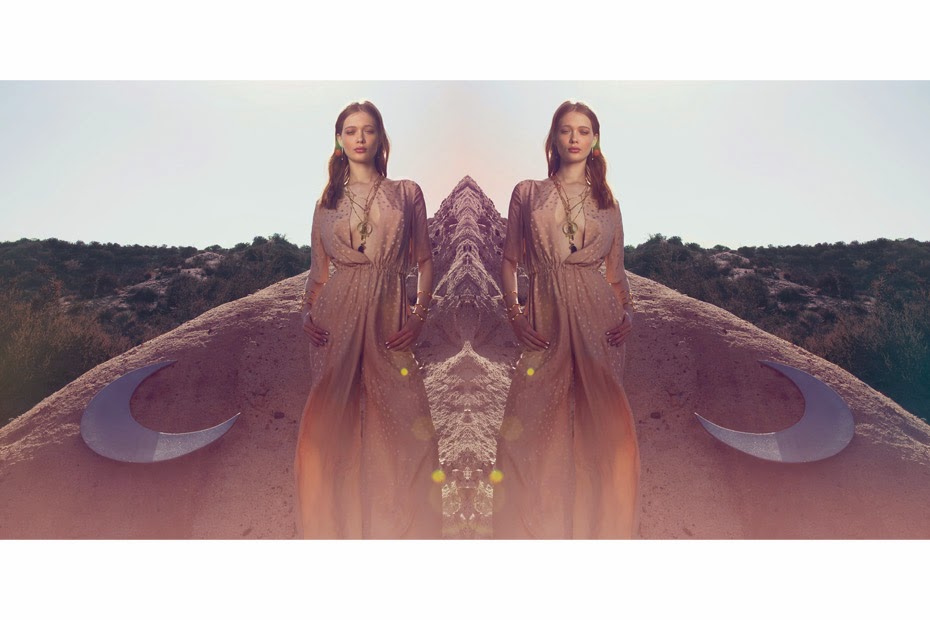

We absolutely loooooove these photos used for the Illuminations collection. We especially love the giant moon prop, and thought that we will need something like this when we hold our photoshoot!! Also, the way that the model positions her body works really well for selling jewellery, as your eyes are directed straight to the accessories, which is something we need to make sure works when directing our models. We love the fact that the photoshoot is on location, but this would probably be quite a hard thing to organise! But we can have a look at possible locations in the yorkshire area none the less!
Location Ideas...
Whitby Abbey
Whitby Abbey could be a good location, as it's easy to get to and will make a wonderful backdrop for photographs! Also, being in the middle of nowhere will allow for no interruptions.. We wouldn't want to be getting in the way of people!


Wuthering Heights
The Yorkshire Moors could make a really good location for the photoshoot, but it might be a bit bleak at certain times of the year, and will be really cold in the winter, so time of year will need to be taken into consideration if we were to go up there!

North York National Park
Near Ravenscar there's a coast line and fields after fields of national park. Would be a very English setting, and would make some rather dramatic photographs. Could maybe even go down to the coastline and take some beach photos?

Whitby West Cliff Beach
A possible beach location, though I'm not sure how quiet the location will be.. Or how easy it is to get to...

Otley Chevin
Another park in Yorkshire, but a lot closer to Leeds than most of the locations I've been looking at, as it's just a bus ride over to Otley!


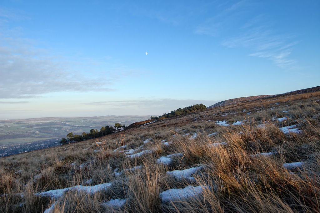
Ilkley Moor
Baron and dramatic.. A lot of different textures and areas of the moors in Ilkley, so could suit a variety of photoshoots. Quite a contrast in colours between the two photos below as well, so could find a variety of different areas to work in.

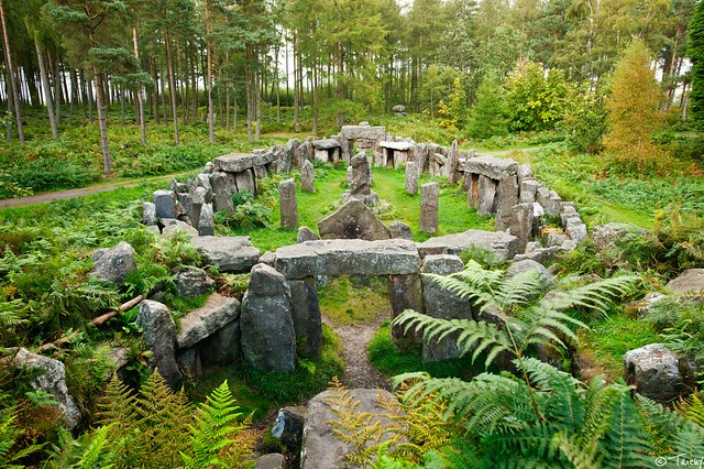
Twelve Apostles, Ilkley Moor
A photoshoot in a stone circle could work really well as it will link to the "cosmic" feel that we're going for. Will have quite a hippy vibe to the photos, and would look pretty against the colour of the heather flowers on the hills.

Druid's Temple, Swinton
Ooooooo or the Druid's Temple near Swinton would be a really good location! It's dramatic and very historic. Would suit the hippy and cosmic vibe to our Bohemian brand. Would also be an interesting location to shoot in with the models.

Interesting Photoshoots...


I really like this photoshoot, because of how bright the colour choices are. The vivid colours help emphasise the patterns in the clothing and make the images pop. I also love how they've played around with the model's eyebrows - which seems to be a very trendy thing in the fashion industry at the moment. The bright and bold colours are also broken up with all the splashes of white - in the eyebrows, amongst the pattern, and even on the model's nails.


I really love the elegance portrayed in these jewellery photos, however I don't think it will really suit our brand as it's a bit too stripped back. I think that the audience and the overall feel to our brand will be more Bohemian / trippy, and not so much about the elegance of the jewellery. However, I found this set of images alluring, and thought that they could even be influential in the poses of our models.
- Leave your comment • Category: Brief 02 - Lunasol Branding, Collaborations, OUGD603
- Share on Twitter, Facebook, Delicious, Digg, Reddit
Brief 1
To produce a vinyl cover for Evian Christ's mix called Duga-3. The client requested that the 10hz ticking noise was reproduced somehow in the album art.
We were asked to collaborate with set partners in the class, my partner was Sophie Abell. Sophie and I decided to listen to the mix and write down initial thoughts and ideas. We also researched into what Duga-3 was and this gave us a more focused insight.
Our initial thoughts:
- Trippy
- Hypnotic
- Kaleidoscope
- Windchimes
- Screechy
- Ambient
- Underwater
- Dramatic
- Traffic
- Motorway
- Tunnels
After research into Duga-3 we came up with the following thoughts:
- Russia
- Chernobyl
- Silence
- Deserted
- Radioactive
- Uninhabitable
- Steel yard
- Radio waves
- 10Hz
- Russian Woodpecker
- Mind control
- Structure
- Soviet
- Tapping
- Circular base
We spoke about several ideas, and then decided to work on something based around the idea that the Duga-3 was nicknamed the "Russian Woodpecker". We went to the mac suite and printed off several relevant images, including images of woodpeckers. Using tracing paper, we both sat and drew different design ideas.
My Ideas:

I thought it would be interesting to try and enrapture the movement of a woodpecker, so I traced over the image of a woodpecker using simple lines over and over to make it look like the woodpecker was pecking.
I then played around with this idea on Illustrator..

At first I traced over the drawing and played with the colours to add some Russian communist colours into the design.

II also played with how the drawing could look in a repeated circle. This started to look a bit too chaotic and messy, so I thought about simplifying the drawing and working with the singular woodpecker..

I then played around with some more ideas..

Playing on the idea of movement of a woodpecker, I blurred the line drawing to make it look like fast movement caught in action. I quite liked this idea, but felt it was a bit too simple and straight forward.
That's when I thought of repeating the singular woodpecker in a full circle to see what would happen.

I really liked this effect and showed Sophie who also really liked how it looked. But we both thought it might be a bit too intense, and the colour might need some consideration. So I created another pattern and changed the colour...
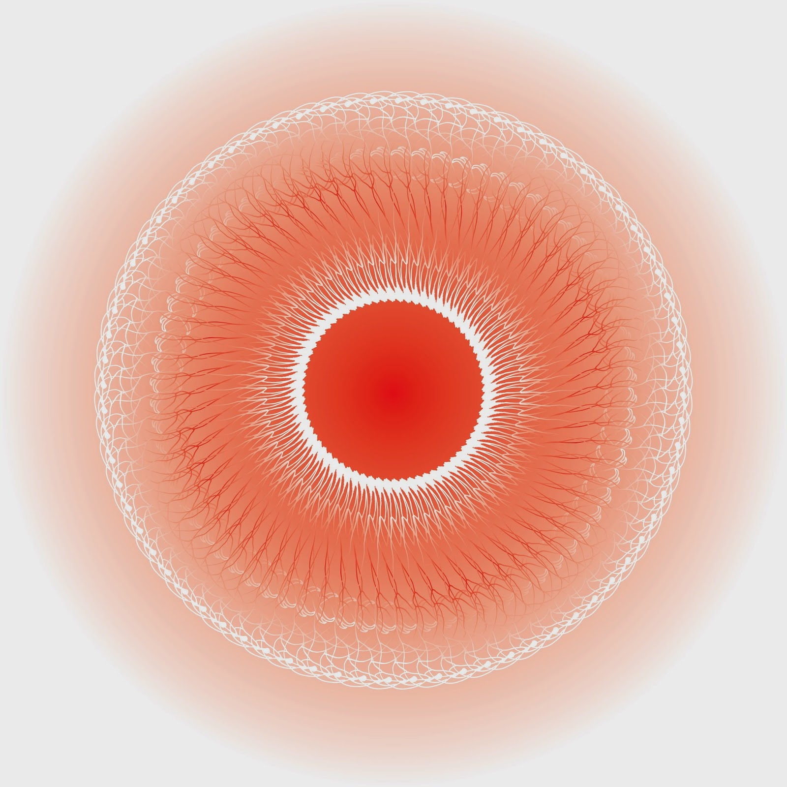
This really didn't work that well, and was a bit like the eye of Sauron... So I simplified the pattern and asked Dr Me who told me to try inverting the black and white colours and add some simple text, and this was the final design..


I was really pleased with this outcome as it was different to what I usually produced yet still worked well! Dr Me were also impressed and said that it met the brief perfectly.
Brief 2
To create a poster for Odonis Odonis using the body copy given..
For brief 2, we listened to some music by Odonis Odonis and came up with the following poster. We didn't have that much time to work on it, as we had concentrated on brief 1 for a bit too long! I used an image of the band and altered their faces to make them look blurry..
Before

After

Sophie and I thought that this worked really well, so Sophie went through creating the poster design with me on my laptop..

I wasn't entirely pleased with final outcome, but I think that's because we lacked time so couldn't play around with the type layout properly to create something impressive. It was also annoying that the logo created for the band already really didn't suit their image, so we ended up designing around the logo aesthetic, which I didn't think suited the band at all.
- Leave your comment • Category: Brief 06 - Dr Me, Collaborations, OUGD603, workshop
- Share on Twitter, Facebook, Delicious, Digg, Reddit