After much consideration with Jessie, we decided not to carry on with this brief. I found it really hard to meet up with her as she was busy with work and it was hard to find the time to talk about where we would be taking things. It was also hard to stop her from making loads of changes, as she was constantly changing her mind and couldn't really decide how she even wanted her brand to look like or to resemble. This made working for her difficult, as I felt as though I was putting in a lot of time for not much reward (as she wasn't paying me and was offering her photography skills in return if I needed them).
After speaking to Amber about the difficulties with working with Jessie, we decided that it wouldn't be worth stressing over this brief as I needed to work on my dissertation etc. However, we did decide that it would be a good idea to design what I would've produced for Jessie but in a way that I would've liked the brief to go if I had carried on with it!
I decided to create mockups of the final designs, rather than printing and photographing the brief as I didn't really want it to go on for much longer and I didn't feel as though there was much point in getting the work printed as I wasn't entirely proud of what I had been producing.
I decided to keep the rest of the branding stationary very minimal and just highlight the colour red here and there, as this linked back to the idea of the compass in the logo and the theme of the brand.
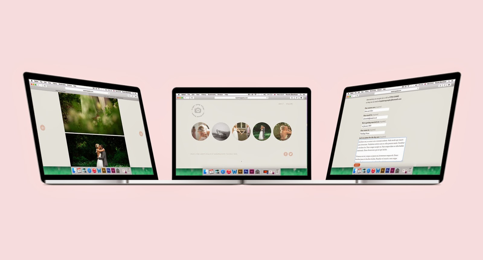
You can see the website for real at: www.bytphotography.com
Please bare in mind that the website wasn't entirely finished in terms of content and was only filled with images that were supplied to me by the client.
I liked the idea of having triplex cards so that the edges could be red, for an extra flash of colour like in the mockup above. Unfortunately I couldn't figure out how to make it look the same on the below mockups.
I also thought that she could send out large watermarked photographs in some kind of pack as a form of promotion to potential customers.
I produced the web design on Wordpress. The circles used for the photographs were inspired by the circular shape of the logo itself.

As I created the site live on Wordpress, I could easily make the website responsive so that it worked across different platforms too.
- Leave your comment • Category: Brief 03 - BYT Branding, Live Briefs, OUGD603
- Share on Twitter, Facebook, Delicious, Digg, Reddit


