Showing posts with label Live Briefs. Show all posts
I found the Peter and Paul brief enjoyable but very challenging. I was excited to get to work on this brief as I had loads of ideas to contribute and was working with Sarah Heal, who I hadn’t managed to work with before. Deciding to collaborate with Sarah was a really good idea, as we both share common interests and passions for lettering, as well as being able to come up with fun and crazy ideas together.
What I found challenging about this brief was being able to meet up with Sarah regularly to work on it. We were both very busy with COP work and other commitments at the time and the type of design that we were producing required dedication and a lot of sitting there for hours fiddling around on Illustrator. Illustrator was another challenge for me. I’m not that confident when using the software for vectorising hand rendered sketches, so when it came to bringing our typography into the software I definitely felt out of depth. Sarah is such a wizz kid when it comes to Illustrator so was happily working away on loads of complex parts of the design, whilst I sat there struggling to create realistic leaves, vines and grapes!
This brief was extremely time consuming, but I learnt a lot from Sarah about Adobe software and feel so much more confident with Illustrator because of this brief. I think that if I hadn’t felt so out of my comfort zone when it came to vectorising the artwork, then I would have been able to contribute to the final design a lot more. However, a lot of the time I would try to tackle a part of the design and Sarah would just redo it for me as I hadn’t done it properly.
I think that me and Sarah work well together, but if we collaborate again in the future, I would like to try and do something that is less software based and more to do with both of our drawing skills, as I think we could create a really exciting piece without Adobe!
- Leave your comment • Category: Brief 04 - Peter & Paul, Collaborations, Competitions, Evaluations, Live Briefs, OUGD603
- Share on Twitter, Facebook, Delicious, Digg, Reddit

Although our concept wasn't picked for the competition, we weren't discouraged and decided to mockup how it could have looked if we had been picked. I think that the design would still need finishing if it was chosen for the wall space, but other than that I think that the space would have been so interesting to look at and I think that incorporating the water fountain was such a good idea!
- Leave your comment • Category: Brief 04 - Peter & Paul, Collaborations, Competitions, Live Briefs, OUGD603
- Share on Twitter, Facebook, Delicious, Digg, Reddit
I finally received some photos of the book printed and bound by the client. Annoyingly, the photos that they sent over to me did not meet expectations at all! You can tell that they quickly took the photos on their iPhone, so the quality isn't very good. This was definitely disappointing as I was hoping for some amazing images for my design boards!!
What was even more annoying is each book costs £240 so I couldn't even ask for one to be sent over to me to take photos myself.


It was really good to see how they considered the finishings though, as I wasn't sure what they were going to do with the front cover or how they would be binding the book. I think that the publication does look really nice finished and it's really exciting to know that my work has been used for a real life client and is shown to all of her clients too!
- Leave your comment • Category: Brief 01 - Tephi Lookbook, Live Briefs, OUGD603
- Share on Twitter, Facebook, Delicious, Digg, Reddit
I really didn’t enjoy working on this brief at all, which is why I didn’t actually manage to complete it. I have decided to not include it within the design boards for this exact same reason, but the work that I did do for the brief can be found on my blog.
I decided to keep the work I did produce up on my blog, because I learnt from working on the DSM brief that I don’t think I could ever work for commercial branding. I have come to learn that I like to design things for small one-off businesses or individuals, rather than large corporations like train companies. I also think that showing the kind of work that I don’t enjoy within my blogging helps to reinforce the type of designing that I love and the kind of designer that I would like to be when I graduate.
Although I was really happy with the concept that I came up with and the logo produced, I found the brief tedious and hard to work on properly. I felt that discontinuing the brief was the best idea, as I didn’t want to spend hours working on something that I really couldn’t stand when I had more exciting and worthwhile briefs to be working on instead for my portfolio!
- Leave your comment • Category: Brief 10 - Design Something More, Competitions, Live Briefs, OUGD603
- Share on Twitter, Facebook, Delicious, Digg, Reddit


We both thought that our idea should incorporate the water fountain, as we didn't like the way the fountain currently looked and thought that we could make it more exciting and blend into the surroundings better!
We decided to turn the water fountain into an Italian Renaissance water fountain:


Going from there we discussed how we could turn that whole area into a Renaissance corner. We thought about typical Italian things, and then thought about grapes and grapevines that could creep up the wall. Then I thought - why not turn the grapevines into typography? As we both really enjoy drawing type, so this would be a really good way of using our strengths together to collaborate fully!


We started off with a few dodgy sketches to get more of a feel of how vines could work with typography.

This slowly developed into the words "Welcome To Graphic Design", which we both took turns in sketching out on top of one another's sketches.


These sketches were traced over continuously in order to get better shapes within the letterforms and to work out how everything would interlink as naturally as possible, in order to look like a grapevine is wrapping around itself to create the letters.

Sarah sketches out a few different bits and bobs so we could discuss how the vine would work as a tree and how the leaves and fountain would work.
Meanwhile I was tracing over more and more typography to get it as close to perfect as we could before we took it into Illustrator.


We then thought about how the typography would intertwine with the vines and branches of the tree as a whole. We also decided to work out how the fountain would fit into this design.


For the other wall space, we decided to go with the idea of making it seem like you were looking at an animal conservatory and the designers were animals inside. We thought that this idea could link in with the renaissance water fountain downstairs by creating our very own Roman Zoo upstairs, so all the design styles would be very typical of Renaissance design, that way the designs would interlink and be similar to one another.


- Leave your comment • Category: Brief 04 - Peter & Paul, Collaborations, Competitions, Live Briefs, OUGD603
- Share on Twitter, Facebook, Delicious, Digg, Reddit


Having a look at Jessica Hische's typography was definitely really worth while and gave us both loads of different ideas as to how we should tackle our typography for the brief. It helped to see how we coud incorporate leaves and ornaments to our lettering, as neither of us have produced lettering that is quite so heavily illustrated before. Looking at lettering like the ribbons type she created also helped with understanding looping letters to create shadows etc.
- Leave your comment • Category: Brief 04 - Peter & Paul, Collaborations, Competitions, Live Briefs, OUGD603
- Share on Twitter, Facebook, Delicious, Digg, Reddit
I learnt a lot about awkward clients from working on this brief. I definitely realised that setting limits and asking to be paid, rather than doing work in exchange for their skillsets, is a lot more beneficial as it means that the clients won't waste your time. I have also found that when you ask to be paid by a client, it scares off any time wasters!
Working with Jessie when we met up was really useful. I hadn't worked with a client face to face before, but it was really helpful as we could bounce ideas off of one another. Talking to Jessie face to face also helped with understanding the brand properly.
I haven't really done that many branding briefs, so this was definitely a challenge for me as it felt like a lot to take on. However, I really enjoyed working on it as it made a change from the usual stuff that I worked on. Deciding to stop working for Jessie took a lot of stress off of my shoulders and meant that I could concentrate on my COP and work on finishing her brief in the background, rather than making it priority.
I learnt a few different things about Illustrator and Photoshop from working on this brief, but the main things that I learnt were when it came to web designing on Wordpress. I didn't realise that you had to work through the wordpress.org in order to totally customise the coding, which was annoying as we had directed the custom URL to wordpress.com and you can't redirect a URL for a few months. This meant that my web design ideas were very limited, however I really liked how the website ended up looking!
I think that working on this brief taught me a lot about working with clients and also made me feel a lot more confident about my skills and designs.
- Leave your comment • Category: Brief 03 - BYT Branding, Evaluations, Live Briefs, OUGD603
- Share on Twitter, Facebook, Delicious, Digg, Reddit
After much consideration with Jessie, we decided not to carry on with this brief. I found it really hard to meet up with her as she was busy with work and it was hard to find the time to talk about where we would be taking things. It was also hard to stop her from making loads of changes, as she was constantly changing her mind and couldn't really decide how she even wanted her brand to look like or to resemble. This made working for her difficult, as I felt as though I was putting in a lot of time for not much reward (as she wasn't paying me and was offering her photography skills in return if I needed them).
After speaking to Amber about the difficulties with working with Jessie, we decided that it wouldn't be worth stressing over this brief as I needed to work on my dissertation etc. However, we did decide that it would be a good idea to design what I would've produced for Jessie but in a way that I would've liked the brief to go if I had carried on with it!
I decided to create mockups of the final designs, rather than printing and photographing the brief as I didn't really want it to go on for much longer and I didn't feel as though there was much point in getting the work printed as I wasn't entirely proud of what I had been producing.
I decided to keep the rest of the branding stationary very minimal and just highlight the colour red here and there, as this linked back to the idea of the compass in the logo and the theme of the brand.
You can see the website for real at: www.bytphotography.com
Please bare in mind that the website wasn't entirely finished in terms of content and was only filled with images that were supplied to me by the client.

I liked the idea of having triplex cards so that the edges could be red, for an extra flash of colour like in the mockup above. Unfortunately I couldn't figure out how to make it look the same on the below mockups.


I also thought that she could send out large watermarked photographs in some kind of pack as a form of promotion to potential customers.


I produced the web design on Wordpress. The circles used for the photographs were inspired by the circular shape of the logo itself.
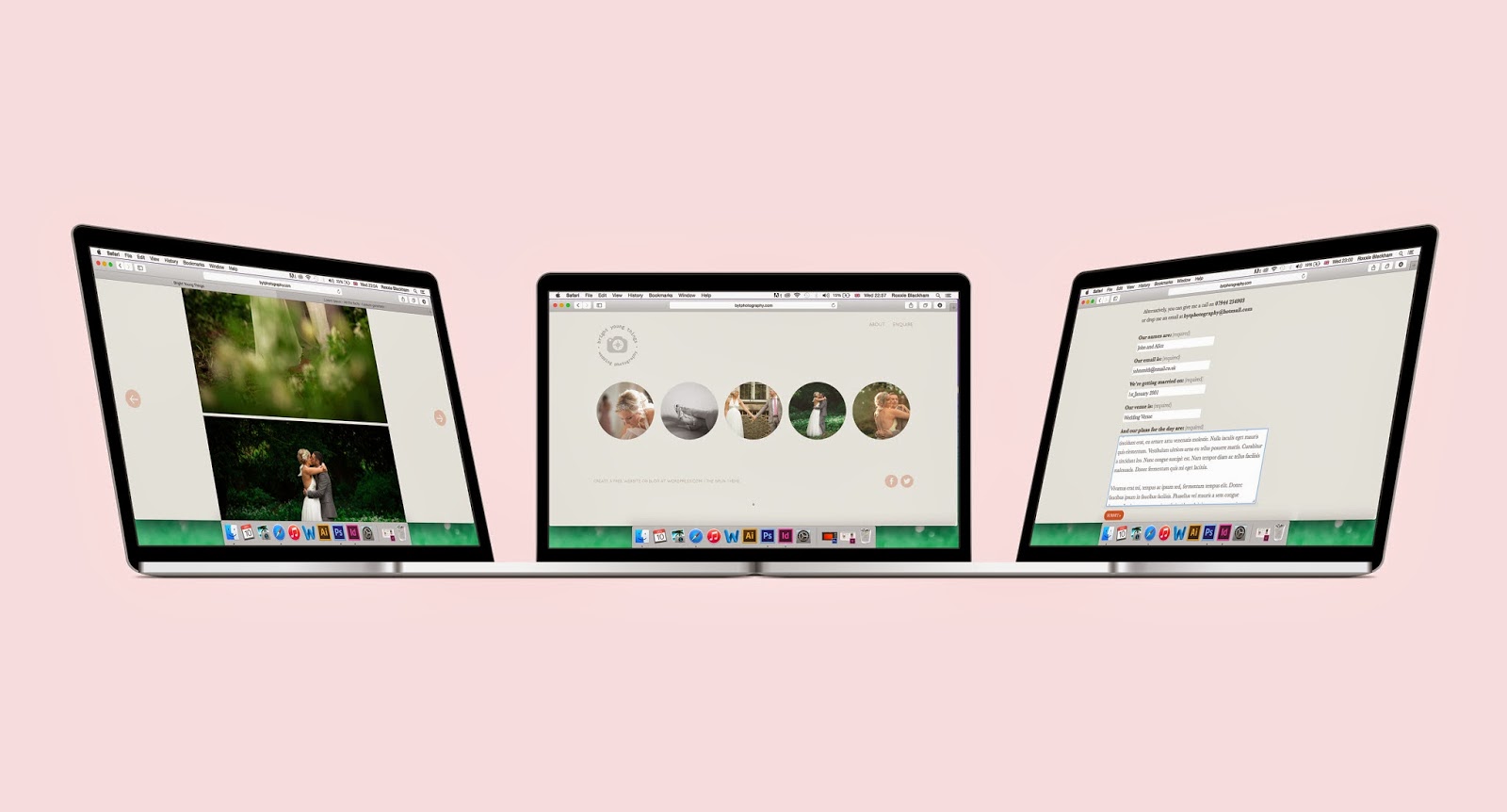


As I created the site live on Wordpress, I could easily make the website responsive so that it worked across different platforms too.

- Leave your comment • Category: Brief 03 - BYT Branding, Live Briefs, OUGD603
- Share on Twitter, Facebook, Delicious, Digg, Reddit
OUGD603: Jessie Leong Further Logo Development (Brief 3)
by Roxxie Blackham on Wednesday, 29 October 2014
After a quick chat over the phone, Jessie had a few new ideas for her brand that she wanted me to play around with. She had thought about her target market for wedding photography, and realised that she wants to work with a secondary logo based around her love for outdoor weddings. She was interested in working with a compass shape, or ways of incorporating nature into the secondary logo, so I had a little go on Illustrator before meeting up with her a day later...
When I met up with Jessie, we spoke about where to take her brand now and I received the following feedback:
- Try writing the words around the camera in the logo in a circle
- Image watermark (compass icon, byt icon - show more examples of these)
- Have a look for a b that works better (easier to read) for the logotype
- Maybe try a different typeface? Think about legibility
- Have a look at www.jamesandlianne.com/wedding-photography-contract-form/ for booking form inspiration and details
- Banner watermark (include contact details, location, logo etc)
- Think about pinterest, twitter, instagram, facebook and their icons
- Business cards (play on maps, scales, meter readings, compass design, details on the back "find me at...")
I've decided to work with the following logo..

And banner logo..

Jessie was a bit unsure about the typography, so I showed her how the logo could work as watermarks..

And how the banner logos could work on images as well..


I think the banner logo works really well in context, as it adds another element to the photos and helps bring in the branding ideas. I also really like the shape of the logo, as the curved element makes it softer against the images.
After Jessie saw how the logo works as a watermark, she was a lot happier with where things were going and said that she really likes the logo in white!
Jessie also sent me the following manifesto:
Bright Young Things is a wedding photography company of Jessie Leong, a yorkshire-based photographer who specialises in the outdoors. Whether its up a peak of a mountain or walking through the depths of a forest, Jessie hopes to bring her love of working in all conditions and beautiful views to her photographs, and wants to work with couples who love it too.
I created some banner images that she could use on her website or to send out in her pack to prospective clients.


- Leave your comment • Category: Brief 03 - BYT Branding, Live Briefs, OUGD603
- Share on Twitter, Facebook, Delicious, Digg, Reddit