Brief 1
To produce a vinyl cover for Evian Christ's mix called Duga-3. The client requested that the 10hz ticking noise was reproduced somehow in the album art.
We were asked to collaborate with set partners in the class, my partner was Sophie Abell. Sophie and I decided to listen to the mix and write down initial thoughts and ideas. We also researched into what Duga-3 was and this gave us a more focused insight.
Our initial thoughts:
- Trippy
- Hypnotic
- Kaleidoscope
- Windchimes
- Screechy
- Ambient
- Underwater
- Dramatic
- Traffic
- Motorway
- Tunnels
After research into Duga-3 we came up with the following thoughts:
- Russia
- Chernobyl
- Silence
- Deserted
- Radioactive
- Uninhabitable
- Steel yard
- Radio waves
- 10Hz
- Russian Woodpecker
- Mind control
- Structure
- Soviet
- Tapping
- Circular base
We spoke about several ideas, and then decided to work on something based around the idea that the Duga-3 was nicknamed the "Russian Woodpecker". We went to the mac suite and printed off several relevant images, including images of woodpeckers. Using tracing paper, we both sat and drew different design ideas.
My Ideas:

I thought it would be interesting to try and enrapture the movement of a woodpecker, so I traced over the image of a woodpecker using simple lines over and over to make it look like the woodpecker was pecking.
I then played around with this idea on Illustrator..

At first I traced over the drawing and played with the colours to add some Russian communist colours into the design.

II also played with how the drawing could look in a repeated circle. This started to look a bit too chaotic and messy, so I thought about simplifying the drawing and working with the singular woodpecker..

I then played around with some more ideas..

Playing on the idea of movement of a woodpecker, I blurred the line drawing to make it look like fast movement caught in action. I quite liked this idea, but felt it was a bit too simple and straight forward.
That's when I thought of repeating the singular woodpecker in a full circle to see what would happen.

I really liked this effect and showed Sophie who also really liked how it looked. But we both thought it might be a bit too intense, and the colour might need some consideration. So I created another pattern and changed the colour...
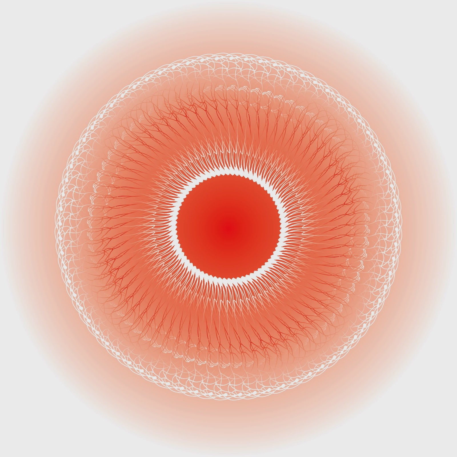
This really didn't work that well, and was a bit like the eye of Sauron... So I simplified the pattern and asked Dr Me who told me to try inverting the black and white colours and add some simple text, and this was the final design..


I was really pleased with this outcome as it was different to what I usually produced yet still worked well! Dr Me were also impressed and said that it met the brief perfectly.
Brief 2
To create a poster for Odonis Odonis using the body copy given..
For brief 2, we listened to some music by Odonis Odonis and came up with the following poster. We didn't have that much time to work on it, as we had concentrated on brief 1 for a bit too long! I used an image of the band and altered their faces to make them look blurry..
Before

After

Sophie and I thought that this worked really well, so Sophie went through creating the poster design with me on my laptop..

I wasn't entirely pleased with final outcome, but I think that's because we lacked time so couldn't play around with the type layout properly to create something impressive. It was also annoying that the logo created for the band already really didn't suit their image, so we ended up designing around the logo aesthetic, which I didn't think suited the band at all.
- Leave your comment • Category: Brief 06 - Dr Me, Collaborations, OUGD603, workshop
- Share on Twitter, Facebook, Delicious, Digg, Reddit