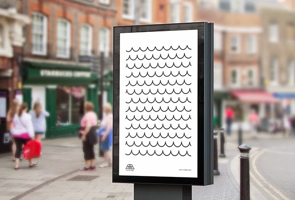
Branding Cities
I thought that it would make sense to have a look at existing city branding, to get some more ideas for the brief and where we could take our designs.
Sterlitamak City
I think that this branding is interesting, but not entirely sure how it reflects the city. The use of geometric shapes makes the city seem quite modernised and contemporary, as well as colourful and fun.
Murmansk
The branding or Murmansk gives off quite a fun and friendly vibe. The use of primary colours makes the brand seem young and approachable. I think the logo is a little bit random, I'm not entirely sure why they have placed the letters in a square layout, but it helps to make the added logo variations work with the main logo.
Melbourne
The Melbourne city branding works as it is flexible and adaptable across the city. The use of bright colours makes the city seem welcoming and modern, and the geometric shapes used help to emphasise the development of the modern city.
Connecting Logos
We decided to look into logos that represented "connection".
LDC Monogram Icon
AP Monogram
Lastweb
HH Monogram
UP Monogram
S Mark Logo
Unii Logo
Amanda Louisi
I really like the look of monogram logos, as they often connected letterforms together or different shapes to create a new icon for the brand that worked really well. I think that something simple, yet interesting like the above logos could work really well for Capital North, by connecting the C and the N together in a monogram form..
The typeface that was created for this brief could work really well for our logo, as it would suit the theme of connection. It also reminds me of the Konekt game that was around when I was younger - similar construction shapes, with bolt holes etc.
Latvia Expo 2010
Will showed us this branding for Latvia, which I thought was really colourful and playful. The adaptable logo works well for a city, as it makes it possible for them to adapt the design across a variety of products and buildings, etc. The use of three-dimensional geometric shapes and letters is engaging and fun, and makes the branding seem quite modern and youthful.
Carrara
I thought that the concept behind the logo for this brand was really interesting, as you can tell that the designer has really been inspired by the Italian landscape and roman architecture/sculptures. It's a shame that the logo has then just been applied to things to make the overall brand - I think that the designer could've considered her application of the logo a lot more, and made it more exciting by creating further geometric shapes etc, but I still really enjoy the logo, because of the suitability to the brand and how it reflects on images that she was initially inspired by.
Vila Da Conde
Once again I found the inspiration for the logo and the construction of the logo itself interesting, as you can see that the designer developed a concept behind the logo, and wasn't just producing something that looked nice, but something that reflected the look of the city. I think logos that are adaptable and inspired by shapes of the cities seem to work well, and have more of a concept behind them.
Parc Olympique
I thought that this branding example was interesting, as they've thought about how to use the circular logo in different ways, rather than just placing it here there and everywhere. For example, how they applied it to the CD in a way that the Olympic rings on the CD artwork align with the rings on the logo when you pull the CD out of the case. It's not entirely my taste, but I thought that it was relevant to our brief, as the rings reminded me of connections and train tracks.
Saransk
I don't particularly like the aesthetics of this city branding for Saransk, but I liked how they came upon the idea behind the logo, by looking at the flags and making a logo out of parts of these flags. I think that the brief could have been taken further and could be more considered on how the adaptable logo would work across the city, but it seems like a start.
Bologna
I think that this city branding is aesthetically pleasing, but I'm not entirely sure where they got the shapes from for the logo. I think that the shapes are a little bit random, so I'm not sure how strong the concept actually is, however the use of the shapes on the posters looks nice.
Valkhof Festival
I think that the branding for this festival has worked really well, as it's consistent and clear across everything. I think that the adaptable logo works well and is well considered. I think that the branding is simplistic, yet complex at the same time, but they haven't overdone it like some festivals do!
Conclusion
After looking at a variety of branded cities/festivals/etc, I found that I like the use of adaptable logos, and I think that our branding will work really well if we manage to produce a logo that is adaptable and can be used across all platforms. I also quite like the use of a variety of colours being used, as it helps to make the cities look youthful and engaging, as well as helping to distinguish between the different logo adaptations. I also really love the use of monogram icons for logos, so will consider this when attempting to produce logo ideas myself.
- Leave your comment • Category: Brief 07 - DBA, Collaborations, Competitions, OUGD603
- Share on Twitter, Facebook, Delicious, Digg, Reddit


