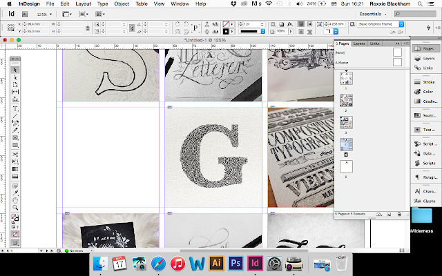
After a lot of consideration and a chat with a few of my peers, I decided to completely change my idea as I didn't feel as though it would meet the brief fully. I also didn't fancy carrying the huge mirror into uni...
I had a really long think about how I research and what my methodology would be.
I realised that I spend a lot of time on Instagram looking at lettering, graphic design and other creative's work so thought that basing my publication around the theme of Instagram made perfect sense as it is definitely somewhere that I go to before I start to think of ideas for my work!
I then had my tutorial with Danny and spoke to him about my idea and we discussed possible ways of tackling the brief in a short period of time.
After having my tutorial with Danny I felt so much more confident about this brief and was excited to get to work on it!
On my way home from uni I thought about the concept and how I could develop upon it and then thought that I should collect a bunch of images from Instagram and arrange them into colour order to create a spectrum of colour.
I thought that it would make sense to make the book into a concertina so that you can unfold the publication into one long line of colour (the length depending on how many images I manage to collect).
So I set out to collect as many images as I possibly could find from a variety of different Instagram accounts. I used an app on my mac called 'Carousel' so that I could bring the photos up larger and drag and drop them onto my desktop to save them at a higher quality, as taking screenshots on my phone would reduce the image quality quite considerably.
A couple of screenshots to show Carousel:
Using Carousel made things a lot easier in terms of saving images etc. However it still took me a full day to collect all of the imagery that I would need as I had to find more images than I needed in every colour in order to be able to create a continuous flow of colour in the publication.
In terms of colour choices I went for the following order:
White
Black
Brown
Red
Orange
Yellow
Green
Blue
Purple
Pink
White
I think that this order of colours was perfect as I didn't want to overly complicate things by adding in different hues or whatever. A few screenshots to show the folders of colours:
Organising each page into a hue that leads on from the previous page and onto the next page was very tedious and quite difficult. It was hard to judge it all by eye, but after a at least 30 hours of organising images, I produced the following gradient and I absolutely love it!
I think that this publication works perfectly to show my design methodology as it follows a subtle yet quite obvious theme of Instagram, because of the layout and size of the imagery. I also think that organising the book into a theme of colours reflects my methodology as I like to organise things I find into collections and I'm always very wary of the colours that I look into when designing anything.
- Leave your comment • Category: Design Publication, OUGD603
- Share on Twitter, Facebook, Delicious, Digg, Reddit


